I am so excited! When Mike and I bought our house in 2009 we
knew that there were a lot of things that we wanted to do to make it nice.
We made a choice to focus on some other projects before tackling the master
bathroom, because I felt it was something that I could live with, and other
projects were priority. I have looked back through my pictures, and I
couldn't find a picture of the master bathroom...so I must have felt like it
was too ugly to show....but I did the best that I could. At first
the floor was the ugly white linoleum that had lots of stains on it. I
covered it up with rugs the best that I could, but I ALWAYS hated that
flooring. It was also in the dining room and kitchen, which I did take a
picture of. Hideous!
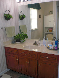
Finally it is time for us to renovate the master bathroom! Mike had already replaced the flooring with some peel and stick vinyl which I love the color of because it hides everything; however, it is not holding up. There are places where the tile has shifted, and again I am covering it up with rugs. There is also an ugly dated wall paper in there....and a dated mirror and light fixture...that I kind of like. I think that means I'm dated as well :).
Here are the before pictures:
 |
| Before picture of mirror and light fixture. I love all of the light that it puts off. 8 bulbs! I also like a big mirror. |
 |
| Before shot of the floor redo covered by rugs because it is not holding up.I love the color. I am just now realizing that my blue trash can should not be in that room. Oops! |
 |
| I wanted a before picture of the cabinet doors and knobs. The square in the doors is an ugly groove. These seem worse than the builder grade cabinets that are currently on the market. |
So....inspiration time! We went to Lowes yesterday to buy a bunch of stuff for the bathroom, and came home with nothing. We weren't really sure what we wanted...and there is so much to choose from. We knew we wanted a new toilet, a jetted tub, new flooring, and to pull the wallpaper down and paint.
We looked at vanities...but almost all 60 inch vanities that I liked were very pricey, and came with dual sinks. Mike and I wanted to retain our counter top space on each side of the one sink. I decided to look on line and see if I could find something inexpensive that I liked. Everything that I found was around $800-$1600 for the vanity and counter top. On Pinterest I saw some courageous people who decided to redo their existing vanities for much less money....so we decided to try it. After all, we were going to buy something new anyway, so why not give it a shot?
Back to Lowes we went today. I decided on a light fixture last night.
We bought the Rustoleum Cabinet Transformation Kit and tinted the base coat Quilter's White. We are going with the unglazed after looking at examples online of other's work.
We are going to try to attempt to paint the counter top. I picked up a sample of a formica piece called mineral sepia to try to reproduce. I bought cheap Walmart craft paint in several colors of browns and grays in order to get close to the color I am looking for. The picture doesn't have as much copper/terra cotta color as it looks in real life.
 |
| counter top inspiration |
Here is a sample of the flooring that I am thinking of
 |
| Flooring |
Here is a couple of examples of tile for the shower wall.
I am thinking to go with a dark tan color on the walls.
We are framing the mirror with moulding
and we are adding a similar moulding on the cabinet doors to cover up the grooves.
Today, we shopped, cleaned, and prepped the vanity, took the mirror down and stripped some of the wallpaper off. He primed the counter top to get it ready for the paint to make the faux granite.


No comments:
Post a Comment